Layouts
ImmyGo provides layout at two levels:
- Declarative
uipackage —VStack,HStack,Centered,Spacer,Flex,Scroll(no Gio imports) - Lower-level
layoutpackage — Avalonia-inspired panels withlayout.Context
Declarative Layouts (ui package)
VStack — Vertical Layout
Lays out children top to bottom with configurable spacing.
ui.VStack(
    ui.Text("Title").Title(),
    ui.Text("Subtitle"),
    ui.Button("OK").OnClick(save),
).Spacing(12)
| Method | Description |
|---|---|
VStack(children ...View) |
Create with children |
.Spacing(dp) |
Gap between children (default 8) |
.Center() |
Center children on cross axis |
.End() |
Align children to end of cross axis |
.Padding(dp) |
Add padding (returns *Styled) |
HStack — Horizontal Layout
Lays out children left to right.
ui.HStack(
    ui.Text("Name:"),
    ui.Spacer(),
    ui.Input().Placeholder("Enter name"),
).Spacing(8)
Same API as VStack — just flows horizontally.
Spacer — Flexible Space
Expands to fill available room. Use between items to push them apart:
ui.HStack(
    ui.Text("Left"),
    ui.Spacer(),      // pushes Right to the far end
    ui.Text("Right"),
)
Fixed spacer for explicit gaps:
ui.FixedSpacer(16, 0)   // 16dp horizontal
ui.FixedSpacer(0, 20)   // 20dp vertical
Flex — Weighted Proportional Sizing
Give children weighted shares of remaining space:
ui.HStack(
    ui.Flex(2, sidebar),   // gets 2/3 of space
    ui.Flex(1, content),   // gets 1/3 of space
)
Flex children can be mixed with regular children:
ui.HStack(
    ui.Icon(ui.IconMenu),           // fixed size (rigid)
    ui.Flex(1, ui.Text("Title")),   // fills remaining
    ui.Button("Save"),              // fixed size (rigid)
)
Centered — Center in Available Space
Centers a view both horizontally and vertically:
ui.Centered(
    ui.Card(
        ui.Text("Centered card"),
    ),
)
Expanded — Fill Available Space
Makes a child fill all available space:
ui.Expanded(ui.Text("I fill everything"))
Scroll — Scrollable Container
Wraps content in a scrollable area:
// Vertical scroll (most common)
ui.Scroll(
    ui.VStack(
        ui.Text("Line 1"),
        ui.Text("Line 2"),
        // ... many items
    ).Spacing(8),
)

// Horizontal scroll
ui.ScrollH(content)

// Efficient scrollable list (only renders visible items)
ui.ScrollList(item1, item2, item3, item4).Spacing(4)
Divider — Horizontal Separator
ui.VStack(
    ui.Text("Section 1"),
    ui.Divider(),
    ui.Text("Section 2"),
)
ZStack — Overlapping Layers with Alignment
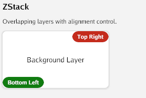
Overlays multiple children with configurable alignment:
ui.ZStack().
    Child(ui.ZCenter, backgroundImage).
    Child(ui.ZTopRight, closeButton).
    Child(ui.ZBottomCenter, caption)
Alignment constants: ZCenter, ZTopLeft, ZTopCenter, ZTopRight, ZCenterLeft, ZCenterRight, ZBottomLeft, ZBottomCenter, ZBottomRight.
Grid — Row/Column Layout
Declarative wrapper for the lower-level GridPanel:
ui.Grid(ui.GridStar(1), ui.GridStar(2), ui.GridFixed(100)).
    Rows(ui.GridStar(1), ui.GridAuto()).
    Cell(0, 0, ui.Text("Row 0, Col 0")).
    Cell(0, 1, ui.Text("Row 0, Col 1")).
    Cell(1, 0, ui.Text("Row 1, Col 0")).
    SpanCell(1, 1, 1, 2, ui.Text("Spans 2 columns")).
    Spacing(8)
Sizing modes:
GridAuto()— fit contentGridStar(weight)— proportional share of remaining spaceGridFixed(dp)— fixed size in dp
AspectRatio — Constrained Proportions
ui.AspectRatio(16.0/9.0, ui.Image(img))   // 16:9
ui.AspectRatio(1.0, ui.Card(content))       // Square
Responsive — Breakpoint-Based Layout
Switch layouts based on available width:
ui.Responsive(
    ui.At(0, mobileLayout),      // 0dp+ (fallback)
    ui.At(600, tabletLayout),    // 600dp+
    ui.At(1024, desktopLayout),  // 1024dp+
)
Visible — Hidden but Space-Preserving
Unlike If() which removes the view entirely, Visible() keeps the space:
ui.Visible(isShown, ui.Text("I take up space even when hidden"))
Modifier Chaining on Layouts
All layouts support modifier chaining via the bridge pattern:
ui.VStack(children...).
    Spacing(12).
    Padding(16).                      // returns *Styled
    Background(ui.RGB(240,240,240)).
    Rounded(8).
    Border(1, ui.RGB(200,200,200)).
    Cursor(ui.CursorPointer)          // NEW: cursor style
Conditional Rendering
If / IfElse
ui.If(loggedIn, ui.Text("Welcome back!"))

ui.IfElse(loading,
    ui.Text("Loading..."),
    ui.Text("Content loaded"),
)
Switch
ui.Switch(currentTab.Get(),
    controlsPage(),   // index 0
    formsPage(),      // index 1
    aboutPage(),      // index 2
)
ForEach
ui.ForEach(items, func(i int, item Item) ui.View {
    return ui.Text(fmt.Sprintf("%d. %s", i+1, item.Name))
})

// With spacing
ui.ForEachSpaced(items, 8, func(i int, item Item) ui.View {
    return ui.Card(ui.Text(item.Name))
})
Group
Compose multiple views at the same origin (like a simple ZStack without alignment):
ui.Group(background, foreground, overlay)
Empty
Zero-size invisible placeholder:
ui.If(showError, ui.Text("Error!")) // returns Empty() when false
Declarative Composition Patterns
App Shell
ui.VStack(
    ui.AppBar("My App"),
    ui.Divider(),
    ui.TabBar("Home", "Settings").OnSelect(fn),
    ui.Divider(),
    ui.Scroll(pageContent()),
).Spacing(0)
Two-Column Layout
ui.HStack(
    ui.Flex(1, ui.SideNav(items...).OnSelect(fn)),
    ui.Flex(3, ui.Scroll(mainContent())),
).Spacing(0)
Form Layout
ui.Card(
    ui.VStack(
        ui.Text("Sign Up").Title(),
        ui.Divider(),
        ui.Text("Name").Small(),
        nameInput,
        ui.Text("Email").Small(),
        emailInput,
        ui.Divider(),
        ui.HStack(
            ui.Spacer(),
            ui.Button("Cancel").Outline(),
            ui.Button("Submit").OnClick(submit),
        ).Spacing(8),
    ).Spacing(10),
).Elevation(2).CornerRadius(12)
Escape Hatch to Raw Gio
When you need fine-grained control for a single component:
ui.VStack(
    ui.Text("Declarative above"),
    ui.ViewFunc(func(gtx layout.Context, th *theme.Theme) layout.Dimensions {
        // Full Gio access: layout.Flex, op.Offset, clip, paint
        return layout.Flex{}.Layout(gtx,
            layout.Flexed(1, func(gtx layout.Context) layout.Dimensions {
                return myCustomWidget.Layout(gtx, th)
            }),
        )
    }),
    ui.Text("Declarative below"),
)
Lower-Level Layouts (layout package)
For users who prefer direct Gio access or need features not yet in the declarative API.
All layout panels are in github.com/amken3d/immygo/layout. Import as:
import immylayout "github.com/amken3d/immygo/layout"
VStack / HStack
immylayout.NewVStack().WithSpacing(16).
    Child(func(gtx layout.Context) layout.Dimensions {
        return widget.H2("Title").Layout(gtx, th)
    }).
    Child(func(gtx layout.Context) layout.Dimensions {
        return myButton.Layout(gtx, th)
    }).
    Layout(gtx)
DockPanel
Pin children to edges of available space:
immylayout.NewDockPanel().
    Child(immylayout.DockTop, func(gtx layout.Context) layout.Dimensions {
        return appBar.Layout(gtx, th)
    }).
    Child(immylayout.DockLeft, func(gtx layout.Context) layout.Dimensions {
        return sideNav.Layout(gtx, th)
    }).
    Child(immylayout.DockFill, func(gtx layout.Context) layout.Dimensions {
        return mainContent(gtx, th)
    }).
    Layout(gtx)
| Position | Description |
|---|---|
DockTop |
Pinned to top edge |
DockBottom |
Pinned to bottom edge |
DockLeft |
Pinned to left edge |
DockRight |
Pinned to right edge |
DockFill |
Fills remaining space (use last) |
WrapPanel
Lays out children horizontally, wrapping to the next row:
immylayout.NewWrapPanel().Children(
    func(gtx layout.Context) layout.Dimensions { return tag1.Layout(gtx, th) },
    func(gtx layout.Context) layout.Dimensions { return tag2.Layout(gtx, th) },
    func(gtx layout.Context) layout.Dimensions { return tag3.Layout(gtx, th) },
).Layout(gtx)
Center / Padding / Expanded
// Center
immylayout.Center{}.Layout(gtx, child)

// Padding
immylayout.Uniform(16).Layout(gtx, child)
immylayout.Symmetric(24, 12).Layout(gtx, child)

// Expanded
immylayout.NewExpanded(child).Layout(gtx)
Using Raw Gio
You can always use Gio’s native layout.Flex, layout.Stack, layout.Inset, and layout.List directly:
layout.Flex{Axis: layout.Vertical}.Layout(gtx,
    layout.Rigid(func(gtx layout.Context) layout.Dimensions {
        return appBar.Layout(gtx, th)
    }),
    layout.Flexed(1, func(gtx layout.Context) layout.Dimensions {
        return immylayout.NewVStack().WithSpacing(16).Children(...).Layout(gtx)
    }),
)